
Hudson’s Bay Holiday
Confectionery Packaging
& Surface Design
PRINT DESIGN | PACKAGING DESIGN | SURFACE DESIGN
My primary role on the Hudson’s Bay Owned Brands Packaging Team within the scope of Holiday Confectionary design was to work on the layouts for product packaging (i.e. applying the product-specific information to the vessel dielines). It was vital to ensure that the technical information was correct, and that packaging layouts were consumer compliant and adhered to Federal Packaging and Labelling Guidelines. In addition to doing the technical portion of the packaging, I was given the opportunity to collaborate or take charge on some of the surface designs that would be printed onto the product vessels (i.e. boxes and tins).
The most challenging part of the holiday confectionery project is typically the sheer volume of SKUs and the tight deadlines. Additionally, since these are consumable items, it is imperative that the product information is 100% correct.
Milk Chocolate Tree Tin
PRINT DESIGN | PACKAGING DESIGN | SURFACE DESIGN
I was instructed to create a surface design for this sculptural metal tree tin using existing holiday motifs and elements that were already being used in other items for this collection. Setting up the artwork for the project involved separating each Pantone colour onto separate layers (including a spot white base layer). The most challenging part of the surface design portion of this project was ensuring that the designs lined up on each side of the tin.
Conceptual Design Mockup

Final Product

Musical Cookie Tin
PRINT DESIGN | PACKAGING DESIGN | SURFACE DESIGN
Similar to with the tree tin, I was instructed to create a surface design for this rotating musical cookie tin using existing motifs and elements. The most challenging part of the surface design portion of this project was ensuring that the designs lined up on each side of the tin, but also in determining the most suitable placement for the designs so that the innermost portion of the tin would have good visibility through the die cuts in the outer portion of the tin.

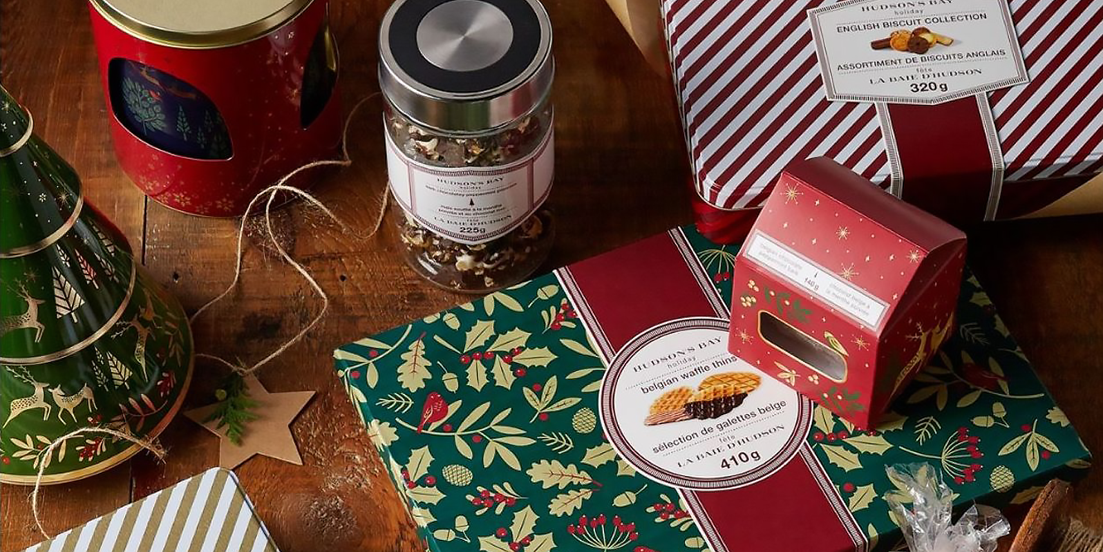
Other Holiday Packaging
PRINT DESIGN | PACKAGING DESIGN
The remainder of the projects shown below are a limited selection of the entire collection, and involved layout and packaging work only (no surface design), however I did prepare the surface design artwork files for production.